Typography 2 - Spring 2026
Task
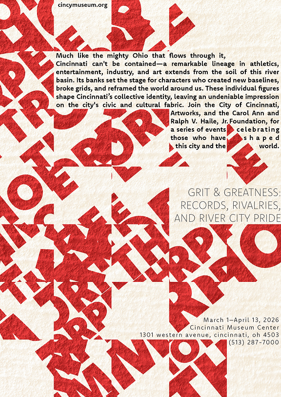
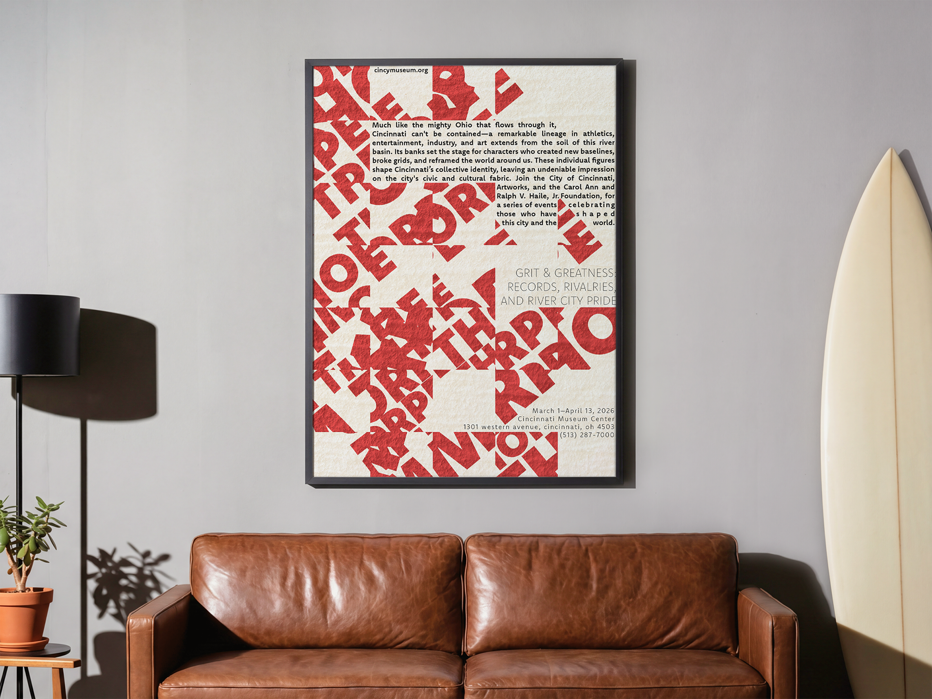
We were asked to design a poster about a famous person from Cincinnati. The project involved using historical research, typography, color, and composition to create a design that is both visually engaging and informative.
Typefaces
I tried several typefaces, such as Clother, Pacaembu, and Komet. I chose Komet because its bold and athletic look matched Jim Thorpe's strength and versatility. It also stayed clean and easy to read throughout the poster.


Colors
I wanted the color palette to feel bold while still reflecting the poster's historical theme. After trying a few options, I chose a simple palette of red, black, and off white. The red and black connect to Cincinnati's colors and link the design to Jim Thorpe's legacy in the city. The neutral background adds a vintage touch and keeps the information easy to read.


Progress work
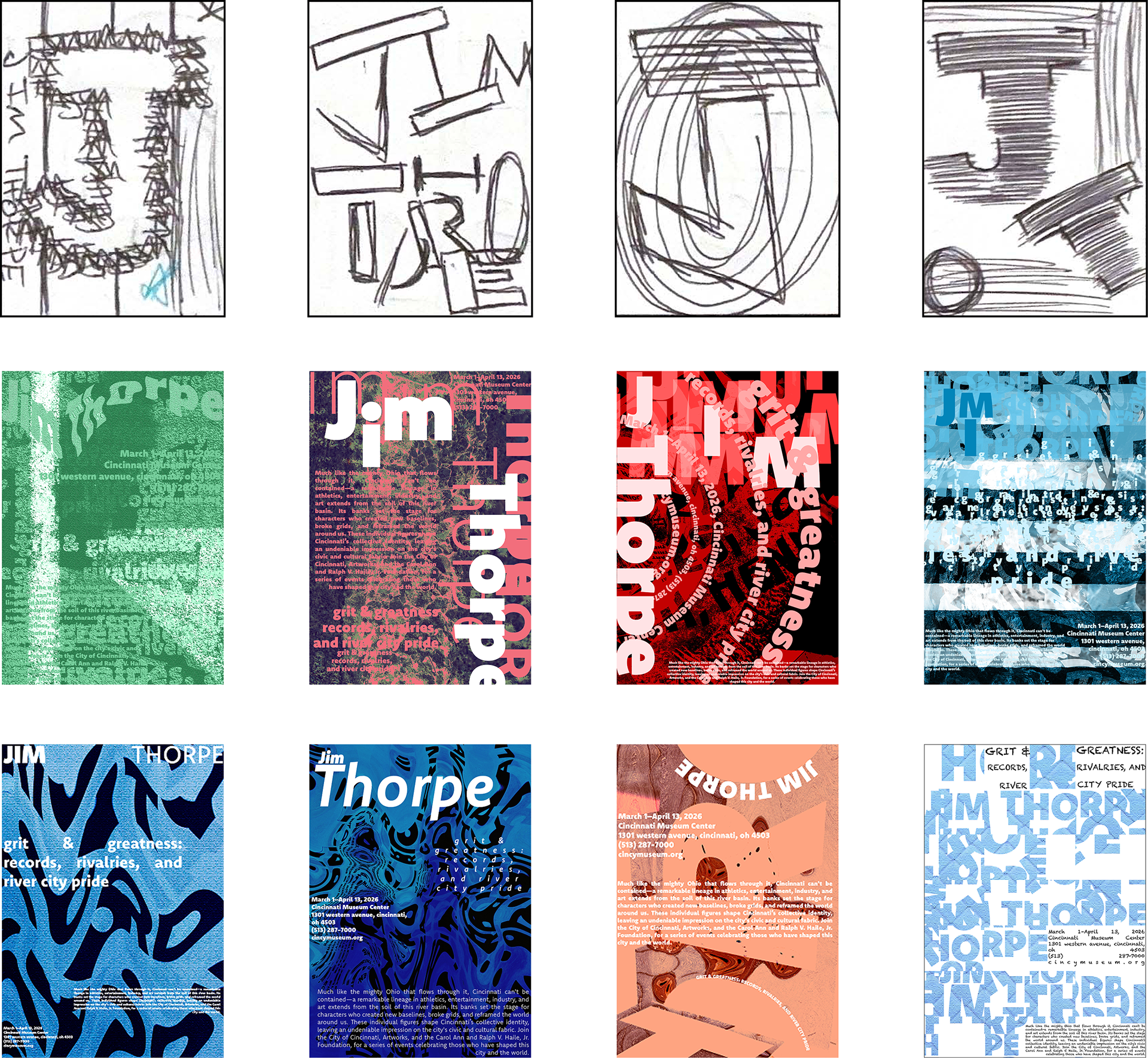
I began by making small sketches to try out different layouts and ways to use type. Then I moved on to digital versions. After experimenting with color, texture, and hierarchy several times, I finished a poster that shows Jim Thorpe’s legacy and his versatility as a multi sport athlete.
Goal
My goal was to highlight Jim Thorpe's versatility as a multi-sport athlete by showing the variety of sports he excelled in. I wanted the poster to share both his athletic achievements and the lasting impact of his success in different fields.