Task
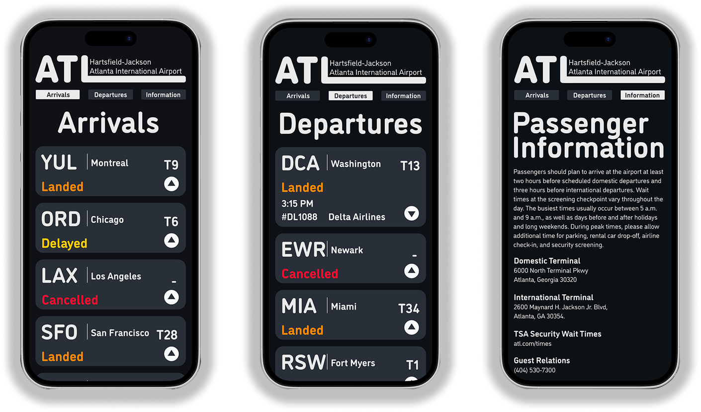
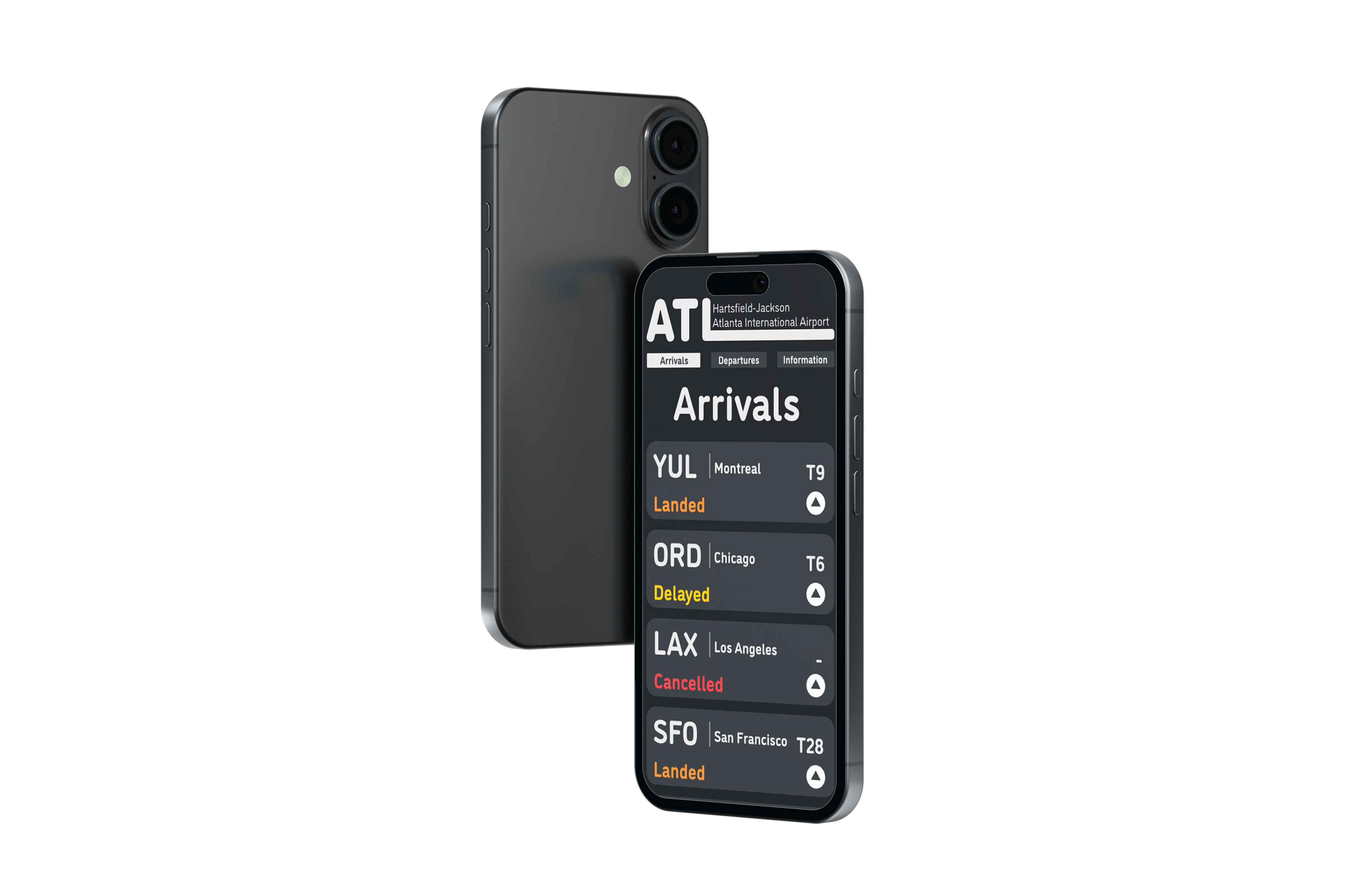
Our goal was to create a clear, user friendly flight tracking app that helps travelers especially first time flyers, navigate airport information with confidence. The design prioritizes legibility and accessibility to minimize stress and confusion throughout the travel experience.
Typefaces
I worked with a few typefaces like DM Mono, Ubuntu, and DINosaur. I ended up going with DINsoaur because of its clean, simple look and how it worked well with many sizes and options while still being easily readable.
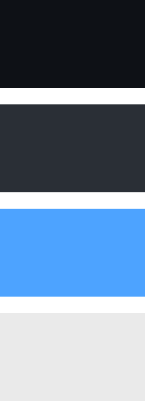
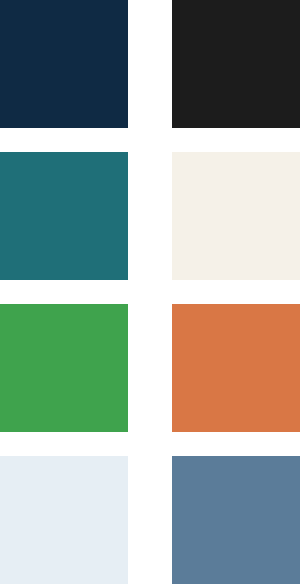
Color Palettes
The main goal was to find a color palette that worked well together while still maintaining a simple, minimal look. After trying a few different palettes, I landed on one with a simple yet effective look, using dark black and grey with light blue and white.
Progress Work
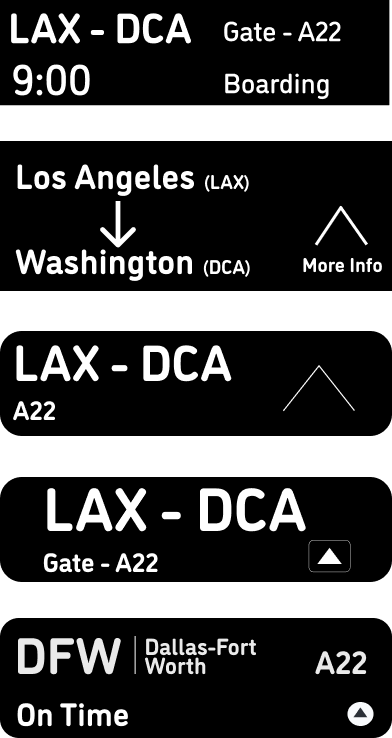
Here’s a look at some of my process work while designing the dropdown sections that organize detailed flight information, with a focus on using scale hierarchy to guide readability and user flow. While making sure to keep it as simple as possible while retaining all the important information.
Final Look